Top 5 Office Color Ideas For 2020

As the New Year approaches and crests, we’re all thinking some version of the same thing: “What should I change and what should I keep the same?” When we compound that with an entirely new decade, it’s natural to want to put on a new coat of paint. While people opt to change their personal style, remodel the house, or improve in other walks of life, you’ve got a job to do. Your job in 2020 is to empower your office and your team members to be their best. Where makeovers of the mind and body are chosen for the individual, you have the doubly hard task of choosing for the collective.
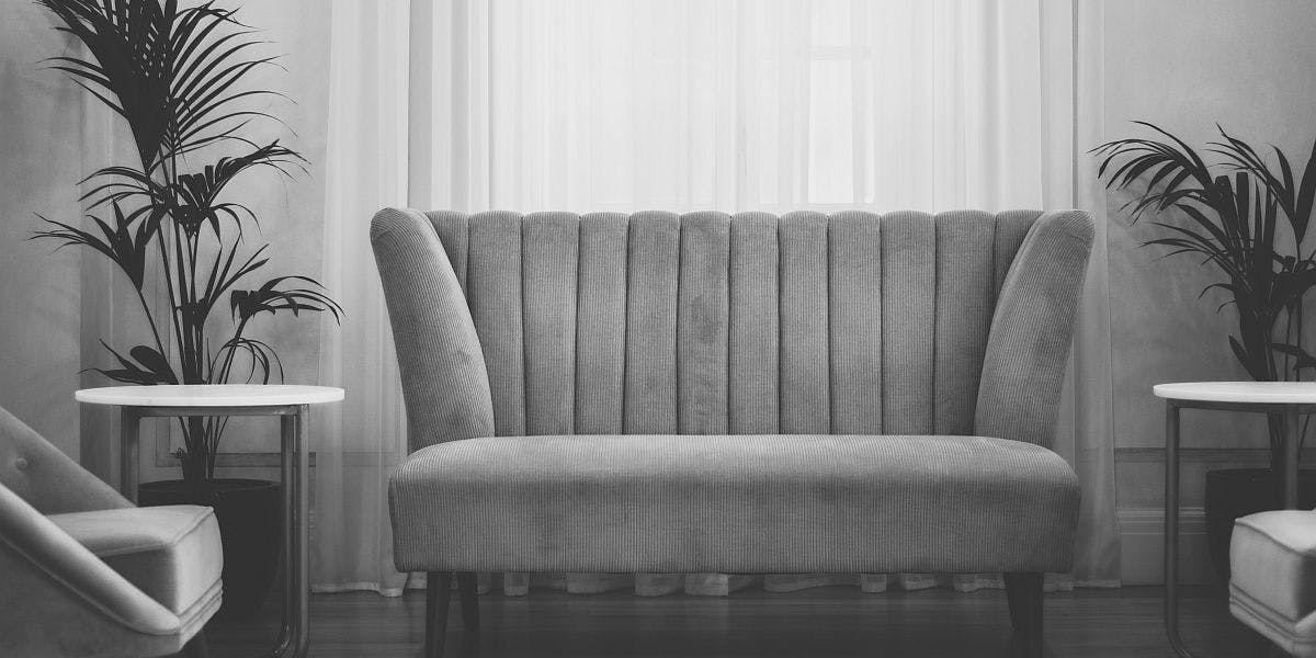
You might be envisioning a major facelift for your office space, with new furniture, layout changes, and major expansion. Whether that’s in the budget or it’s very much not, one of the biggest ways that you can change the mood and atmosphere of your office space is with color. That's where these office color ideas come into play.
How to Transform the Color Palette in Your Office
What you can do with color in a commercial space depends on a few factors. If your brand colors are prevalent in the space, for example, that may be something your company wants to retain. Other office spaces may not subscribe to branded colors for their aesthetic world view, and offer more flexibility. Whether you’re somewhat bound or free to explore, there are many office spaces where color makes an improvement.
Color changes can come in the form of big swaths of paint on big walls or in smaller ways. You might toss out a few throw pillows in a common waiting area, pick up some new art for your white-washed walls, or even add fresh flowers around the space. Whatever assets and elements appeal to your people and your needs can be made more colorful.
How to Choose the Best Colors for Your Office Space
If you are tasked to add some color to your office space in big or small ways, you might be wondering where to start. It’s important to consider the control you have over the space, the mood you hope to evoke, and if possible, to learn a bit about color psychology. Color impacts mood, behavior, and visitor perception. Make sure you speak with your team and get opinions about what colors make people feel certain ways. Consult your brand guidelines, too. Even if this guide doesn’t specify a narrow color palette, the moods and mission articulated there could allude to the right types of colors. Next, you’ll explore the chroma, lightness, and hue of your chosen color scheme, since there are hundreds of shades of blue, red, or any other color.
To help you explore what colors might work best for your brand, we’ve scoped out the options. To get a read on what colors are expected to blossom in 2020, we consulted color authorities like Pantone, color makers like Behr, Sherwin-Williams, Valspar, and Benjamin Moore, and design commentators like Canva, Shutterstock, and Toptal. Through this curation, we pulled together five major color story trends that are anticipated for 2020. Which one would best suit your office space?
What Office Color Ideas Are Trending for 2020?
1. Solid Blues

Blue evokes a combination of strength and serenity, with the chief effect of helping us become or remain calm. Cited studies show that blue, above orange or yellow, makes us feel happier to shop and spend time in a store. We associate blue with safety including campus call boxes, police uniforms, and scrubs. Pantone has predicted (or provoked) the impending trend of basic blues by calling Classic Blue their coveted Color of the Year. PPG followed suit with their Color of the Year, Chinese Porcelain. Other color houses are following suit with similar denims and navies such as Sherwin-Williams’ Naval, Benjamin Moore’s Blue Danube, and two dark blue shades in the 2020 Dunn Edwards trend report: Indigo Nights and Singin’ the Blues. 2020Spaces claims navy blue as a general contender, too.
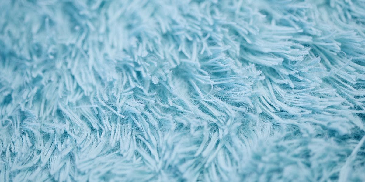
Let’s not stop there, however. 2020 Trend Reports from both Canva and Shutterstock imply a general taste for anti-technology blues that feel safe, Earthy, and tranquil. If dark blue isn’t in the cards for you, try a more subdued or faded blue. Baby blue and sky blue shades, some with grey undertones, were also runners-up. Seek out shades like Windmill Wings and Buxton Blue from Benjamin Moore, Grey Brook and Utterly Blue from Valspar, or Bluebird, a mention on Behr’s aptly named Restore palette.
2. Nature’s Cool Tones
If the thought of a classic blue doesn’t speak to you, consider colors that respect the motivation: to move our offices from places of overt technology and “the grind,” and to turn them into places people want to relax, enjoy their time, and contribute. For this, colorists are looking to the sights and sounds of nature. Green shades are said to relieve stress and represent healing and growth. If those are the kind of wins you want to take into 2020, consider these three top contending “natural” shades:
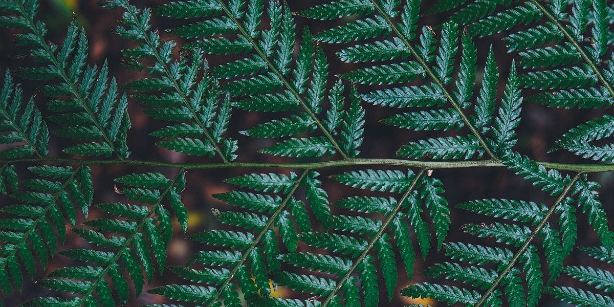
Dark, dusty green: If you’re inspired by something that’s equal parts serene and moody, consider a mossy green. Secret Moss from Valspar is slated to turn heads. You might also love Moss Cottage from Dunn Edwards or Benjamin Moore’s Cushing Green. If you’re looking for something more olive and subdued, Ripe Olive from Sherman-Williams is a trending shade, as well as Behr’s comparable Secret Meadow. You’ll see olive green mentioned as an anticipated trend from 2020Spaces, too.
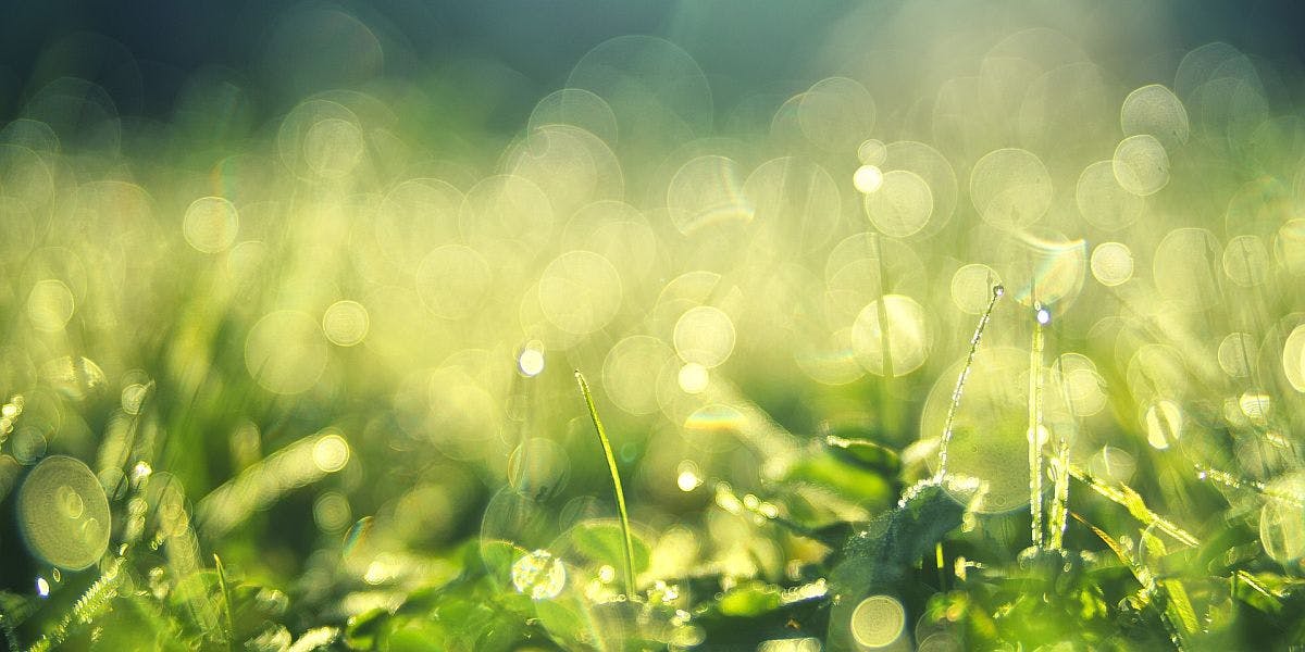
Light, spring green: If dark and mysterious isn’t the right vibe for your business, lighten up! One of Behr’s chief colors of the year is a celery-green shade called Back to Nature, which speaks to the motif here. You might also like a spa-like sage or something sweeter, like Mint Whisper, an on-trend shade from Valspar.

Aquatic blue-green: If you need your green a little left-of-center and you’d like to combine the tranquility of blue and the metamorphosis of green into one, try an aqua or teal shade. Teal can be garish when it’s allowed to take over, but a gentle aqua like Valspar’s Secluded Garden, and the ever-popular shade Dragonfly from Behr is perfect for your workspace. You could even choose a subdued aqua neutral like Benjamin Moore’s Crystalline, too. Dark Seafoam is the Toptal Design Color of the Year for 2020 and Shutterstock taps “Aqua Menthe” as a contender, if you like more assertive teals.
3. Next-Gen Neutrals
We’re talking neutrals in a post about color?! The eggshells and alabasters of the past have been replaced by clean, smooth whites, inviting off-whites and beiges, and greys that are anything but drab. Canva put together a really nice report for the modern use of neutrals as part of their color review. Here’s more on that color family:

Whites: White is white, right? Not so much. You’d be surprised at the way Benjamin Moore’s favorite 2020 white, White Heron, compares to Behr’s Painters White from the very trendy Atmospheric palette. White is a great move if you’re looking to set up a clean slate, imbue sterility and purity into your environment, or you’re aiming for a sense of “completion.”
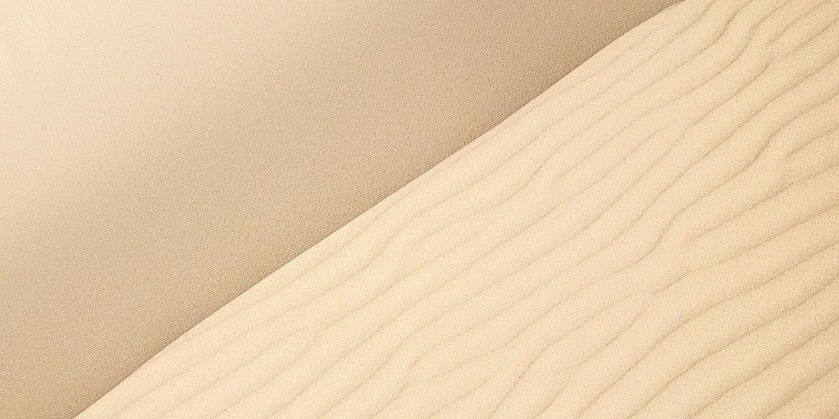
Beiges: Like whites, your off-whites, tans, and beiges will run the gamut from cool and professional to warm and earthy. Neutrals like these do provide a solid background for you to add pops of more energetic colors or, if you like things organic and minimal, stick to this palette alone to set the tone. Look to the beiges of tomorrow, like Valspar’s Canyon Desert and Desert Fortress or Creamy Mushroom from Behr. Sherwin-Williams also offers a few of their trending neutrals including Touch of Sand and Sandbank.
Greys: Grey is never NOT on-trend and 2020 will be no exception. While grey is always a welcome neutral and cool alternative to your tans and ivories, it’s not immune to scrutiny, nor evolution. Spaces clothed in grey will set the stage for stability, compromise, and clarity.
2020Spaces’ roundup brings back darker greys like charcoal, which has been a prevailing shade for a few years. You’ll see this reverberated across the board in Behr’s acclaimed Graphic Charcoal and Dunn Edwards’ Black Tie. Light greys could have an extended moment, too, in color-infused hues like bluish frontrunner Oxford Grey from Benjamin Moore or ‘greige’ shades like Benjamin Moore’s Thunder, Valspar’s Winter Calm, and Battleship from Behr.
4. Sunset Warmth
One of the most prevailing color trends for 2020, seen across the board, is a combination of warm tones that evoke peace, a rose-colored outlook, and a little bit of saucy vacation vibes. If you’re worried this won’t fly in the workplace, reconsider. Pink is considered thoughtful and collaborative while orange and yellow are enthusiastic and attention-grabbing. You won’t find any chocolate browns or fire-engine reds in this year’s lineup, but here’s what you’ll see more of this year:
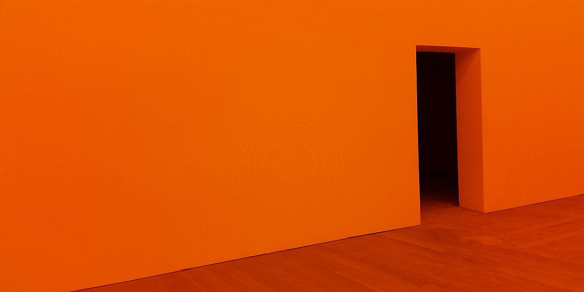
Fiery oranges: From the mention of Mango on the 2020Spaces roundup to the entire “Worldhood” collection from Behr, and much of Dunn Edwards’ “Silk Road” color story, one thing is clear: we are fired up about orange. Sherwin-Williams also popped their tangerine-equivalent shade Tassel into their 2020 faves and you’ll see Lush Lava made Shutterstock’s list, too.
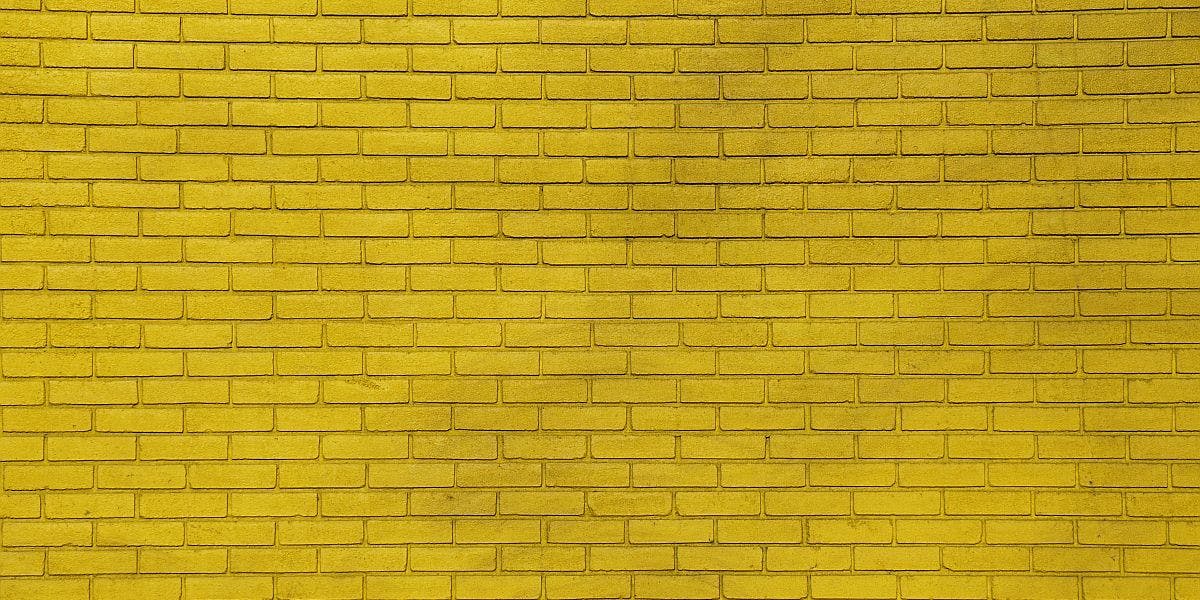
Pure Sunshine: Yellow is a high-risk color that can intimidate a lot of brands. Unless yellow has become your signature hue, a la McDonald’s, Sprint, or Best Buy - you might be afraid to foray into the sunny unknown. Give it a shot! Golden yellows are all over the map from Golden Straw by Benjamin Moore to Gold Gleam from Dunn Edwards. For a more stable option, you might try Valspar’s Tempered Sage or give Charismatic, from Behr, a hopeful try. Yellow is a great accent color, as well, for companies who aren’t ready to go full-dandelion.
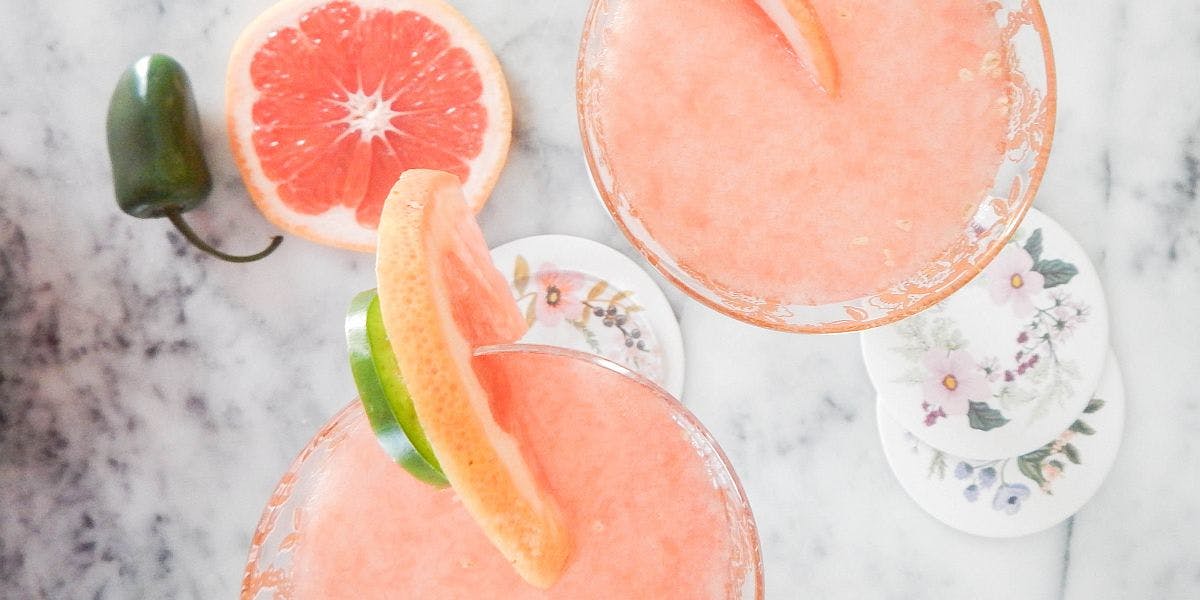
Pinks and peaches: One of the most sought-after colorways for 2020 is the rosy, peachy pinks that remind us of romance. While romance doesn’t have much of a place at work, the daydreamy comfort of a sunset hue can still bring feelings of inspiration and assurance to your team. Benjamin Moore casts First Light as their premiere Color of the Year while HGTV nudged Sherwin-Williams’ Romance. You’ll see staples from Valspar like Bombay Pink, Pale Powder, and Crushed Out topping lists everywhere. Behr’s Bubble Shell headlines their Worldhood palette while Dunn Edwards pushes Glazed Sugar to the forefront. If pink normally makes you think of children’s nurseries or ballet slippers, don’t worry. These pinks leave bubble-gum behind.
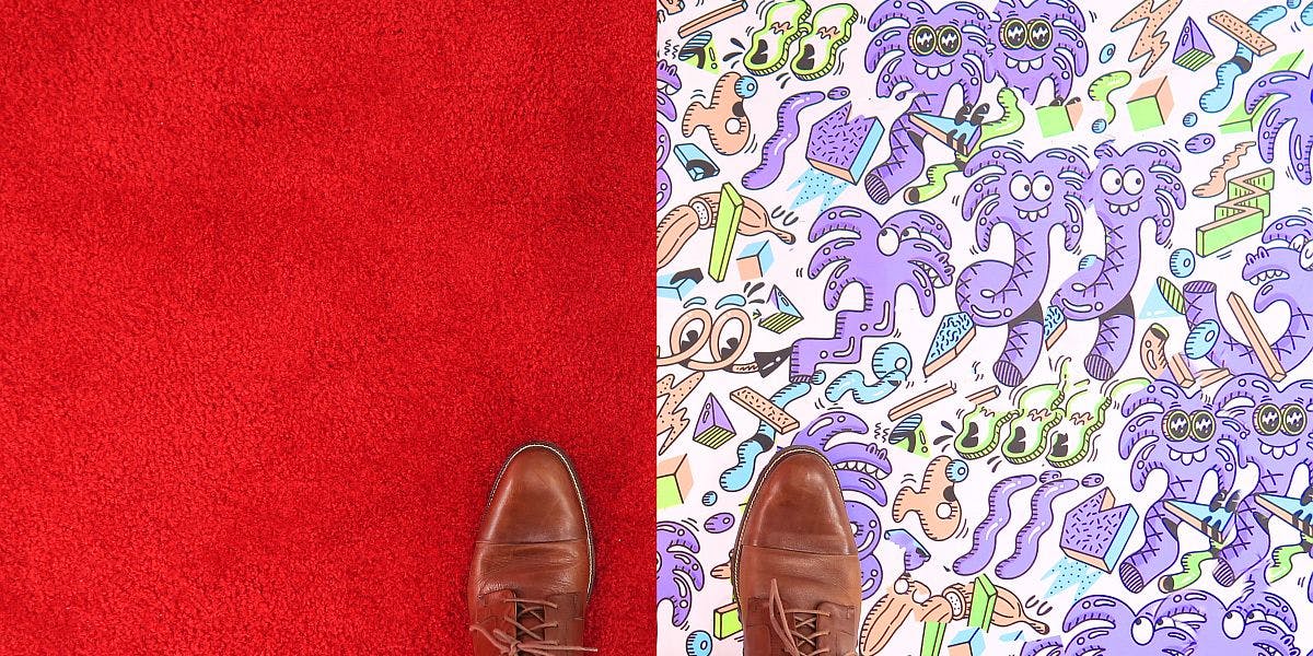
5. High-Contrast Clash
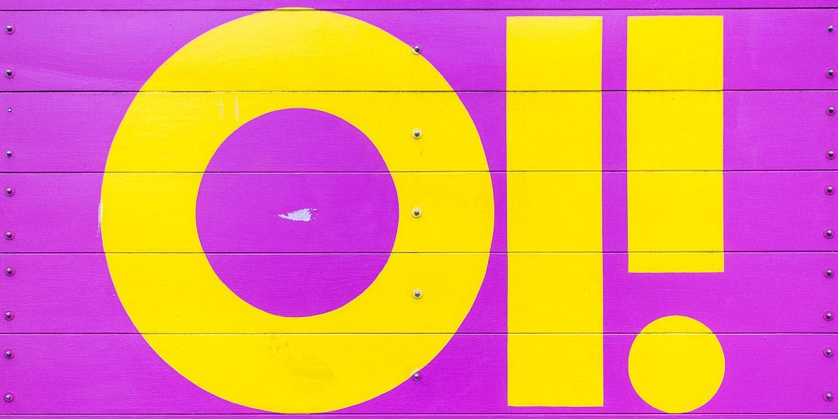
One color trend for 2020 is less about the specific shades you choose, and more about the way they juxtapose. You might pair a vibrant hot pink with a feisty red - a color combination that most brands would steer clear of. Perhaps you’ll get inspired by the 80s and the cyberwave, and choose neon purple and blue? Yellow and white, orange and green, purple and brown - color combinations you’ve never dared to dream are fair game this year. If your company is brave and boisterous, consider trying something more risque.
Color Trends Are Followed, But Brands Are Built
Posts like these make every effort to help you tap into what’s coming for the new year, and that’s net-positive. However, it’s important to remember that following every trend will leave you no better than 2nd place. Think about trends in terms of what speaks to you and makes sense for your brand, your team members, and your atmosphere. Make design decisions that feel right to you and your crew, and consider starting the 2020 trend you want to see.
Looking for a way to manage your workplace more efficiently? Check out what Eden’s Workplace Management Platform can do for your office.
.png)

.png)


